Styling for Moom Lighting
Recently I worked with the brand Moom lighting to create a new set of assets to launch them over the winter period. Here's a little bio from Mooms website below:
Born of a bright idea
Our lights have a rich history. A unique origin that gives them purpose. And it all started with some "chucks"...Steel tools once used in the metal-spinning industry to create shapes as diverse as aeroplane nose cones and musical instruments. Sadly, as with much in today's world, these once-purposeful objects were eventually rendered obsolete. Seeing these unique and fascinating shapes collecting dust in the workshop sparked our Co-Founder James' bright idea to bring them back to life and create something new.
The opportunity:
We were tasked to create a range of styled sets which took their existing brand to the next stage, to show off the artistry and craftsmanship of the product. We looked and their existing photography and suggested how could build on it and I began the task of picking colours that complimented and contrasted their range, along with a selection of props that could work in those environments, picking out key colours to pull through.

Light is one of the key factors and I worked closely with James Williams to see how we could elevate the photography through lighting. We referenced imagery with shards of light and textural backdrops to see if we could take inspiration from this. We popped the mood-board above together as inspiration of how we could play achieve this.
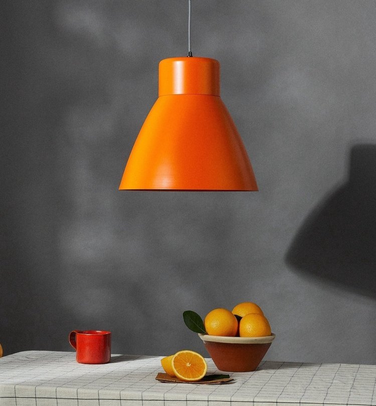

We had a lot of products to shoot. It was the most I've ever shot in one sitting so there were limitations and we had to try our best to move quickly through them mixing and adding variation in styling where possible. As you can see it was a mad day at the studio! (Thank you Francys for your constant styling support)

We loved references of photography where they almost felt painterly so also brainstormed how we could achieve this and not let the budget escalate too much, it can really clock up quickly so we need to have a balanced approach. Below I've added some top tips for when it comes to styling.
These include:
Fresh fruit & Veg - it's not only low in cost but bold and graphic and falls beautifully into that still life category, James from Moom brought along a Marrow and it was the perfect fit.
Highstreet homeware has such a huge variety, H&M home and Zara home being my staples for essentials mixed with higher-end pieces such as the Palm Beach book used. (They have a whole collection and I’d have them all if I could)

Curated/Specialist magazines - still not too much of a price tag but can look amazing and always have beautiful photography and designs. I love snooping on Stacked for magazine inspo
My process is to first think of the story, what time of day is it? Breakfast, evening tea? This can help to choose items that work together. James from Moom did however, want to push things into the unexpected a little so where possible we tried to work with a couple of key items, including that marrow and my whippet Blue. :D

The short timeline on the project meant we couldn't push this as far as we like but in those cases, I would recommend thrifting at vintage and charity shops or even eBay for unique one-off items you wouldn't be able to find elsewhere but this is a little riskier and does add time onto a project. (That'll have to wait for the next shoot) and is something as a stylist/set designer I would love to develop further.
To take a look at their lights you can visit it thisismoom.com or alternatively, if you need a hand with styling/set design, drop me a message. :)
Images from the project are here :)